Developer-first Angular UI

Ply — the first rich Tailwind component ecosystem built for modern Angular.

Ply — ply-ui.com — is a CLI-first Angular + Tailwind CSS component library with 215 components and blocks (125 free), delivered shadcn-style: npx ply-ui-cli add <name> copies the TypeScript/HTML source into your project, where you own and edit it. There is no npm library package.

Figma Design System

Forget massive npm packages. Build your application component by component.

npx ply-ui-cli init

# Choose exactly the components you need:
npx ply-ui-cli add dialog
npx ply-ui-cli add button
npx ply-ui-cli add card

# AI agents: npx -y ply-ui-mcp

The code gets copied straight into your project's source directory, ready for you to customize.

CLI First

CLI First (The Shadcn Model)

Use our interactive CLI to selectively add components — no bundle bloat from npm install.

Customizable

Add only what you need

Run npx ply-ui-cli add [component] to add a single component. Say goodbye to bundle-heavy libraries.

100% Control

Full Source Code Control

Edit Tailwind classes or TypeScript methods directly in your project — no complex library overrides needed.

AI agentsFree tier

Install Ply from your agent — not just your terminal

Ask Cursor, Claude, Kimi, VS Code, Windsurf, or any stdio MCP client to search the catalog and add free components. MCP wraps the CLI; Pro add uses PLY_LICENSE_KEY. ChatGPT/Gemini chat: npx -y ply-ui-mcp --http --read-only.

  • Search — find components by name or intent
  • Get — metadata and deps before you install
  • Add free — installs via ply-ui-cli under the hood
  • Own the source — files land in your project

Works with

  • Cursor
  • Claude
  • Kimi
  • VS Code
  • Windsurf
npx -y ply-ui-mcp
Copy-in, not a package

What is Ply?

Ply — ply-ui.com — is a CLI-first Angular + Tailwind CSS component library with 215 components and blocks (125 free), delivered shadcn-style: npx ply-ui-cli add <name> copies the TypeScript/HTML source into your project, where you own and edit it. There is no npm library package.

No. Ply at ply-ui.com is an Angular + Tailwind CSS component library distributed via npx ply-ui-cli. MUI's Base UI (base-ui.com) is an unrelated React library. Uber's Base Web is also unrelated.

  1. Run the CLI

    npx ply-ui-cli add button
  2. Files land in your project

    src/app/components/button/

  3. You own the source

    Edit Tailwind classes, rewrite the template, or delete the file.

Components

Browse all

Launch-ready Angular UI that snaps into your codebase — customize every Tailwind class and TypeScript method.

Blocks & Layouts

Drop pre-built sections into a page, or start from a full layout — both are Tailwind-editable source in your repo.

Templates

Browse all

Complete apps with routes and states wired up. Each bundle includes a Ply Pro license.

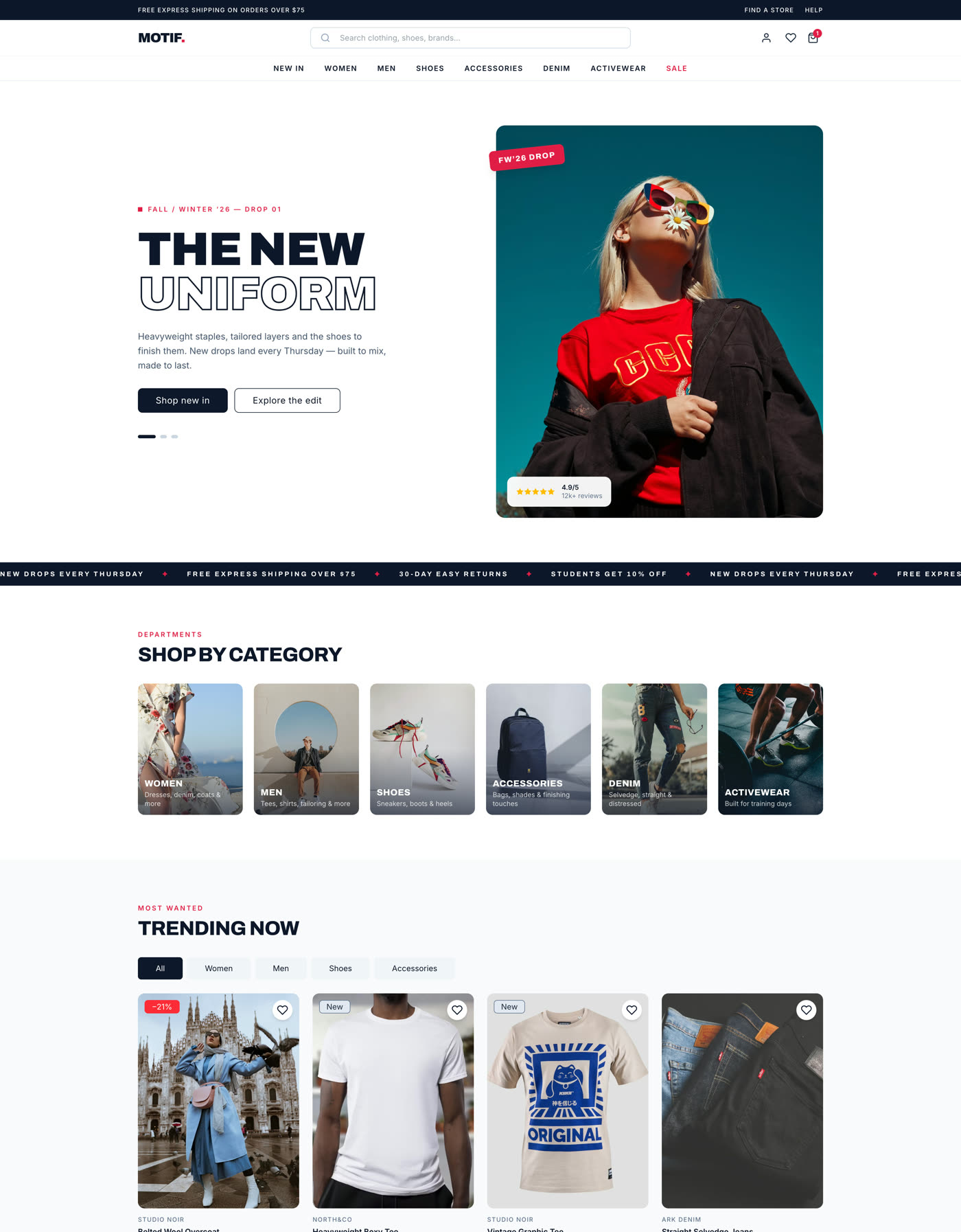
Motif storefront home page with a full-bleed seasonal hero, shop-by-category tiles and a trending product grid
TemplateIncludes Pro

Motif — A complete Angular commerce storefront

Motif is a production-ready fashion storefront built entirely with Ply Pro — mega menu, product listing, product detail, cart, checkout, order tracking and an editorial journal. Every route is source code you own, not a theme you rent.

20+
Pages & routes
60+
Components used
100%
Source you own
SSR
Prerender-safe
$149one-time, includes Ply Pro
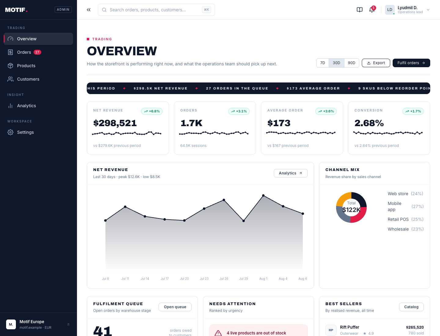
Motif Admin overview dashboard with KPI cards, revenue chart, channel mix and fulfilment queue
TemplateIncludes Pro

Motif Admin — A complete Angular commerce operations dashboard

Motif Admin is the back-office that runs the Motif storefront — overview KPIs, order fulfilment, inventory, customers, analytics and settings. Built entirely with Ply Pro. Every route is source code you own, not a theme you rent.

6
Core app routes
40+
Components used
100%
Source you own
SSR
Prerender-safe
$149one-time, includes Ply Pro
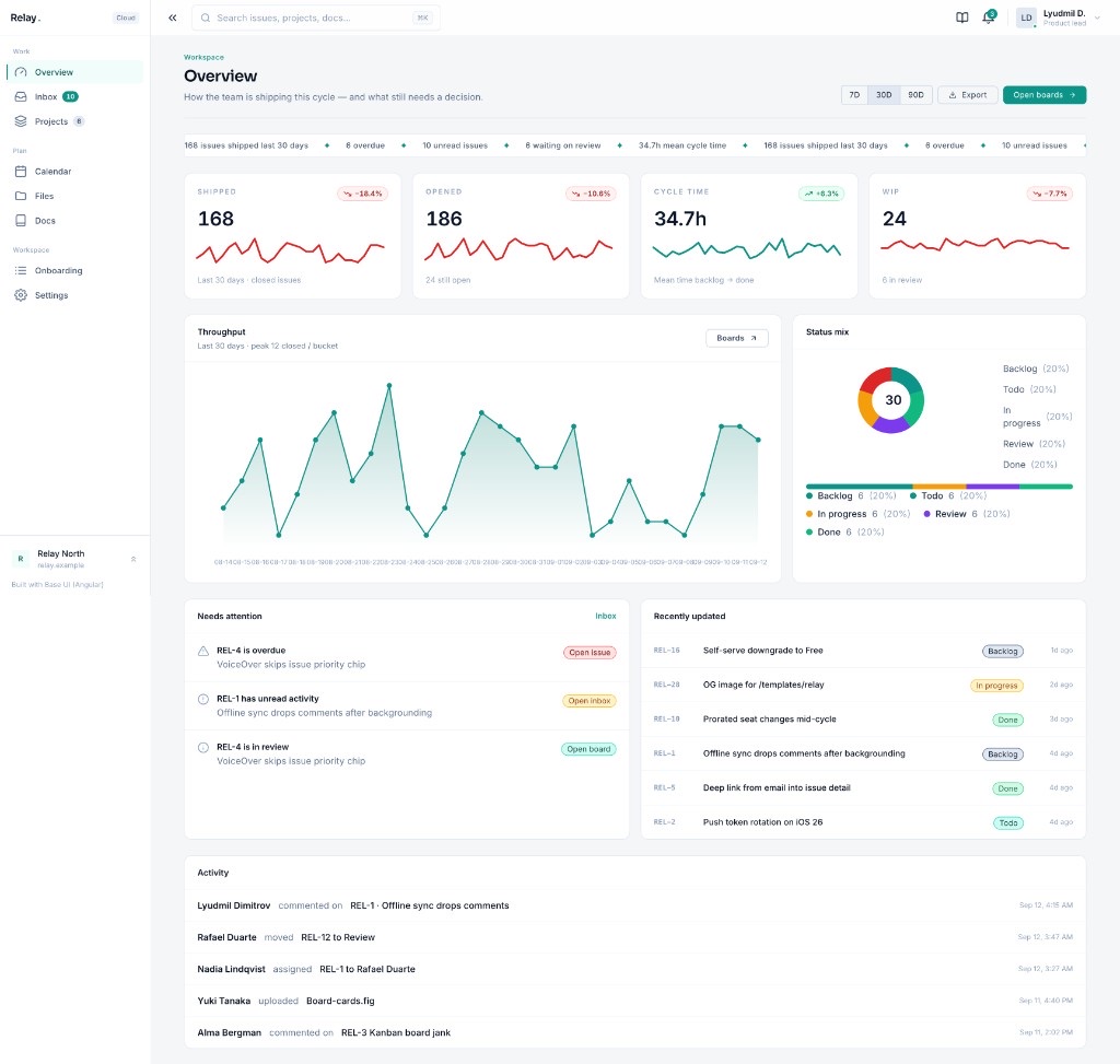
Relay overview with KPI cards, throughput chart and activity ticker
TemplateIncludes Pro

Relay — A Linear-style Angular team workspace

Relay is a production-shaped team workspace built entirely with Ply Pro — projects, a bound kanban board, issues, a Linear-style inbox, calendar, files, docs, and settings. Every route is source code you own, not a theme you rent.

12
App routes
50+
Components used
100%
Source you own
SSR
Prerender-safe
$149one-time, includes Ply Pro

One payment, infinite access

Unlock our entire library of 212 components, blocks, and layouts—plus every future update—for a single, one-time fee.

Pricing

Build free with 125 components. Upgrade to Pro for production-ready layouts you truly own.

Ply Free

Free

Open source
components

  • 125 components — every UI primitive
  • All 19 form blocks (login, checkout, wizard…)
  • CLI installs — you own the source
  • Free for unlimited projects, no account
  • SSR-safe — every route prerenders, enforced in CI — how we verify it
  • Official Figma Design System included
Most Popular

Ply Pro

$99.00

One-time payment
for full access

  • Everything in Free, plus 90 pro blocks, widgets & layouts
  • 18 full-page layouts & apps (dashboard, workspace inbox, kanban, pricing, docs…)
  • Blog, ecommerce, media & social blocks
  • Advanced widgets: data table, editor, gallery, command palette
  • License key delivered instantly — installs via the CLI
  • Lifetime updates & support — changelog
  • WCAG-oriented accessibility report for procurement — view ACR
  • Pro blocks and layouts are SSR-safe too — read the write-up
  • 14-day money-back guarantee
Get Ply Pro

Need a team license for up to 10 developers, or have questions first? Compare plans · Full FAQ · Compare libraries · Enterprise FAQ

Frequently asked questions

Short answers for how Ply is installed, licensed, and how it differs from MUI's Base UI. Versus Material, PrimeNG, NG-ZORRO, Taiga, and Spartan: compare libraries.

Ply — ply-ui.com — is a CLI-first Angular + Tailwind CSS component library with 215 components and blocks (125 free), delivered shadcn-style: npx ply-ui-cli add <name> copies the TypeScript/HTML source into your project, where you own and edit it. There is no npm library package.

No. Ply at ply-ui.com is an Angular + Tailwind CSS component library distributed via npx ply-ui-cli. MUI's Base UI (base-ui.com) is an unrelated React library. Uber's Base Web is also unrelated.

125 items are free — every UI primitive, all 19 form blocks, directives, services, utilities — with no account required. 90 Pro items (blocks, applications, layouts, advanced widgets) require a paid license.

npx ply-ui-cli init once per project, then npx ply-ui-cli add <name>. Omit the name in a terminal to pick from the catalog (filter, then type to select). --yes and CI need explicit names. Components land in src/app/components/<name>/ by default and are yours.

Yes. The docs site prerenders every catalog route to static HTML, and a blocking CI job fails the build if any route stops rendering.

Yes. npx -y ply-ui-mcp is stdio for Cursor, Claude (Code/Desktop), Kimi, VS Code, Windsurf, and other local hosts. ChatGPT and Gemini chat apps use Streamable HTTP: npx -y ply-ui-mcp --http --read-only (catalog tools) or local --http without --read-only so add/init/update can see the project. Pro add uses PLY_LICENSE_KEY on the MCP process. Editors that skip MCP can copy the Cursor rule and snippet pack from https://ply-ui.com/getting-started/#editor-rules.

Material is an npm component library with Google's Material Design look. Ply copies Tailwind-styled source into your repo — edit the markup directly, no ::ng-deep overrides, no theme API to fight.

Get new components in your inbox

One email when we ship new blocks, layouts or guides — including what's new in Pro. No spam, unsubscribe anytime.